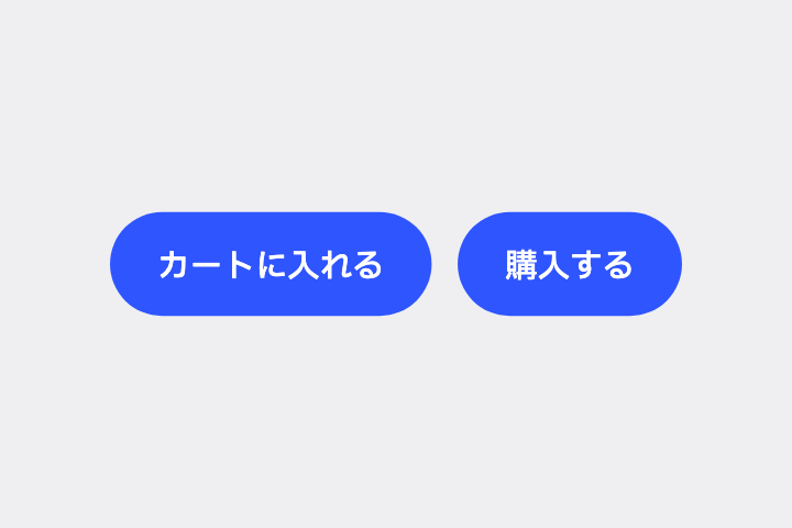
主要ボタンの隣に、secondaryContainer 色で淡く塗った Filled Tonal Button を置いて。
# Filled Tonal Button / トーナルボタン(淡色の塗りつぶしボタン)

- id: `filled_tonal_button`  URL: https://uizukan.dev/entry/filled_tonal_button/
- 種別: 表示 / Buttons
- 別名: Secondary Button, Tonal Button, Soft Button
- 呼び名: Material 3=Filled tonal button / Material 2=該当なし(M3 で追加。近いのは secondary 色の Contained button) / Android (Compose)=FilledTonalButton / iOS (HIG)=Button(UIKit の tinted style が相当) / SwiftUI=Button + .buttonStyle(.bordered) + .tint() / Web=該当なし(Secondary button として実装) / Flutter=FilledButton.tonal
- Flutter: `FilledButton.tonal`
- 関連: filled_button, outlined_button

**説明**: secondaryContainer 色で塗った中間の強調度のボタン。Filled ほど叫ばず、Outlined より存在感がある。iOS の「Tinted」ボタンに相当。

**使いどころ**: 主要 CTA の隣に置く「もう一つの選択肢」(例:購入する/カートに入れる)。

**AI への伝え方(日本語)**: 主要ボタンの隣に、secondaryContainer 色で淡く塗った Filled Tonal Button を置いて。

**Prompt (English)**: Next to the primary button, add a Filled Tonal Button using the secondaryContainer color.
詳細プロンプト は Pro
開発者向け Pro(準備中)で、AI が MCP から直接取りに行けるようになります。名前・デモ・プロンプト・Markdown は無料のままです。
Pro の案内を見る
Flutter コード は Pro
開発者向け Pro(準備中)で、AI が MCP から直接取りに行けるようになります。名前・デモ・プロンプト・Markdown は無料のままです。
Pro の案内を見る