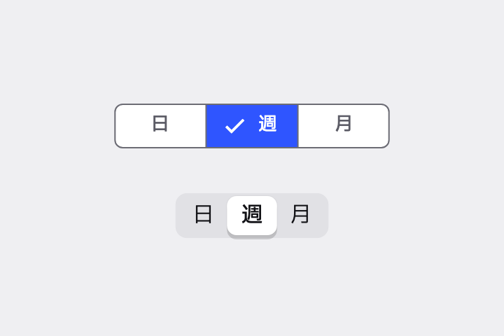
「日 / 週 / 月」を切り替える Segmented Button を作って。iOS 風に、選択のハイライトが滑らかにスライドする Sliding Segmented Control で。
# Segmented Button / セグメントボタン(セグメンテッドコントロール)

- id: `segmented_button`  URL: https://uizukan.dev/entry/segmented_button/
- 種別: 表示 / Buttons
- 別名: Segmented Control, Sliding Segmented Control, Tab Switch, Pill Toggle
- 呼び名: Material 3=Segmented button / Material 2=該当なし(Toggle button(MaterialButtonToggleGroup)が相当) / Android (Compose)=SingleChoiceSegmentedButtonRow / MultiChoiceSegmentedButtonRow + SegmentedButton / iOS (HIG)=Segmented control / SwiftUI=Picker + .pickerStyle(.segmented) / Web=該当なし(role="radiogroup" で実装) / Flutter=SegmentedButton / CupertinoSlidingSegmentedControl
- Flutter: `SegmentedButton / CupertinoSlidingSegmentedControl`
- 関連: toggle_buttons, tab_bar, chips

**説明**: 2〜5個の選択肢を同じ幅で横に並べ、選択中の区画を強調するコントロール。iOS ではハイライトが滑らかにスライドする「Sliding Segmented Control」が標準。

**使いどころ**: 表示モードの切替(リスト/グリッド)、期間の切替(日/週/月)など、少数の排他的な選択。

**AI への伝え方(日本語)**: 「日 / 週 / 月」を切り替える Segmented Button を作って。iOS 風に、選択のハイライトが滑らかにスライドする Sliding Segmented Control で。

**Prompt (English)**: Create a Segmented Control to switch between "Day / Week / Month". Use the iOS-style sliding segmented control where the highlight slides smoothly.
詳細プロンプト は Pro
開発者向け Pro(準備中)で、AI が MCP から直接取りに行けるようになります。名前・デモ・プロンプト・Markdown は無料のままです。
Pro の案内を見る
Flutter コード は Pro
開発者向け Pro(準備中)で、AI が MCP から直接取りに行けるようになります。名前・デモ・プロンプト・Markdown は無料のままです。
Pro の案内を見る